

Improving WooCommerce Checkout Page design for Conversions
The checkout page is the final destination for buyers, where all the designing and marketing efforts have to bring out the benefit for the merchant. The potential buyers fill the details, pay the money and finish the order. The process seems to be simple enough, but it involves a continuous effort of understanding user behavior and modifying the design accordingly.
The improvement of a WooCommerce checkout page depends on the specific business needs, how its target users react to an option, and what are the prevailing trends. For most of the business, the defined trends work perfectly fine, but for others, it may be useless.
For example, a common trend is to simplify the checkout by removing the extra fields. You can easily do so with plugins like WooCommerce checkout field editor. This pluginallows you to reduce some fields or replace them with easy-to-answer options.
Running an online store is quite different than a physical one. In a local brick and mortar store, you personally interact with the buyers, so you have an ample amount of time to convince them until they leave your shop. But, on the checkout page, you are unable to know why exactly a user is abandoning a cart. So, you have to keep on improving the user experience by trying and testing different options. Following are some of the valuable tips that may help you enhance the WooCommerce checkout page design for a higher conversion rate.
1. Create visual context
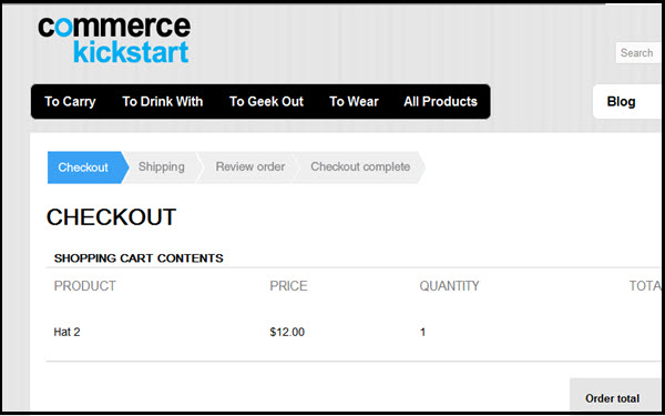
Visual context is a significant part of designing checkout for better conversions. Improve navigational help towards the call to action through appealing icons, images, and options. Make the users feel comfortable with the design so that they can easily fill billing and shipping details.
The visual form of content is more impressive and important than text. With a visual context, a user can easily distinguish each step of a checkout process. For example, displaying the processes with breadcrumbs can help them know the progress of checking out. You can unleash the power of visuals in a different context that can ultimately improve conversions.
2. Display checkout buttons at multiple positions
The core idea of a checkout design is to create ease for the users in finding the call to action. Ultimately, the users will have to take action. The users’ inability in finding a checkout button may increase cart abandonment rate. To serve them successfully close the deal, try to add call to action buttons at the top of the checkout page as well as the bottom.
Most online users are quite accustomedin finding a checkout button at the end of the page. But, displaying the same button on the top facilitates them to complete the order without scrolling down. The result is a swift and hassles free shopping experience.
3. Show credit card logos and security signs
 The online buyers are extra careful in sharing details to the eCommerce websites since most of them are not secure and trustworthy. To make them trust your web shop and make the purchases, display security seals on the checkout pages and logos of the payment options.
WooCommerce is a secure platform, but hackers are always in pursuit finding new ways to access your user data and avail and compromise their funds and privacy. You can strengthen the security by installing reliable extensions and SSL certificate, so the users know that they are browsing a safe and secure shopping platform.
The unavailability of payment gateways is also a barrier in getting higher conversions. Most online users either have restrictions on paying cross border fees or worried for the foreign exchange conversion. It may stop them from completing the transaction. To help them easily pay for your products, you can configure multiple payment gateways and display their logos on the checkout page.
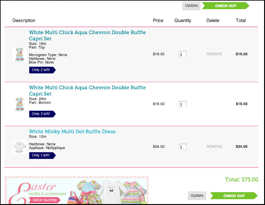
4. Add continue shopping button
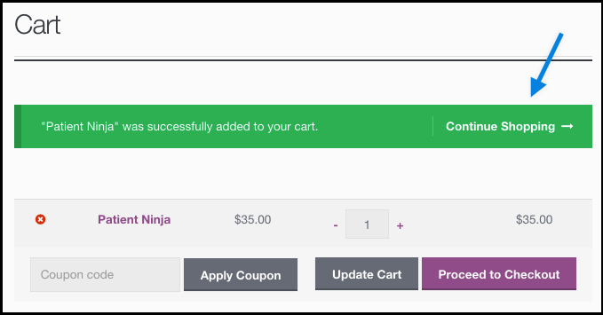
It is not uncommon that users spend a few moments for the final look at the checkout. They may add new products to the cart or miss adding a few they needed. This is most annoying when the this thought returns during the final stages of the checkout. Now, for them, going back means erasing the information they have already entered. Right there, add a ‘Continue Shopping’ button and help them buy anything else while keeping the selected products in the cart.
Adding a ‘continue shopping’ button gives them a chance to select more products without losing the data. For example, a user selects 2 shirts for kids. But, at the checkout page, he comes to know that he will have to incur shipping charges for his limited shopping. If he decides to wave off these charges by shopping for himself, he will need a ‘continue shopping’ button the most. Similar scenarios happen all the timewhere the customers needs a direct access to shopping page while retaining the cart and the entered information.
A pro is to use different colors for the checkout and Continue Shopping buttons. This will help users to distinguish the functionality of each button and can take the required action.
5. Make the user registration optional
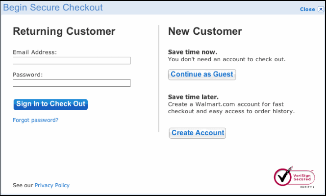
A user is not necessarily interested in your business, as most of them like to make purchases without signing up for an account. Prompting them to create an account before completing an order is a riskymaneuver. Make it a voluntary task to let them continue shopping either as a guest user or a registered one.
The first time visitors of your WooCommerce website may not trust you as much as a regular user. So, making the registration compulsory may prevent them from converting into loyal customers. Offer them to carry on shopping without sharing their personal details. Once they get a positive experience out of your checkout page they will come again to purchase for more and most likely register
The primary purpose of the checkout page is not getting users to sign up for registration. Make it as smooth and distraction free as you can, and the users will definitely return. Give your users the freedom to checkout as a guest or let them register as they please.
Conclusion
WooCommerce is getting famous for its simple anduser savvy interface. It has facilitated merchants to modify their store designs with simple plug-in installation. You can improve the design with visual context, remove the irrelevant fields and use minimalistic attributesto allow users continue shopping. Applying any feature or function to your WooCommerce checkout page requires a thorough understanding of the users and the calculated results after its implementation. You can surely try the above tips to enhance conversion ratio of your eCommerce website.
Author Bio:
Paul SImmons holds expertise in Ecommerce web design and development, and has successfully delivered projects in Magento, WordPress, Shopify, Woocommerce, Joomla and other CMS/shopping cart platforms. His work can be found on FMEAddons, a leading ecommerce web design and development agency. 7 years + experience in Magento, WP and custom work.